Friday, December 30, 2011

Art Connects Us - Postcard Art History


My motto in teaching and writing about art, including this blog, is 'Art Connects Us.' Art History is a wonderful way to feel the lively embrace of the universal human experience, but if you've ever taken an art history class you probably know that the subject is not ordinarily presented as inclusive. I taught the basic Art History survey course for years so I know well the curriculum of  "See what the Greeks did, thought, made - theirs was a distinct culture completely alien to that of 5th c India, 9th c Americas, 16th c Africa, etc., etc., etc." But there is so much art, so many fascinating cultures, time periods, peoples, artists - and it's all part of the human story.

For me the best approach to art history is to find a common ground in a human idea or concern and then have the fun of exploring the endlessly interesting ways in which culture, climate, geography, available materials, beliefs, and individual imaginations conspire to create distinctive expressions of those basic human ideas and values. 
I teach a university class with this approach - it's a rich experience for my students of widely diverse backgrounds and stimulating for me as the teacher. The broad themes sweep everyone into the discussion so no one has reason to feel excluded or sidelined - we're all part of a continuing tradition of art and human expression. Human figures, animals, beliefs, power, wealth, landscapes, family portraits: the list of possibilities never ends. The human face, for example, holds a place of importance in nearly every culture and time and gives clues to deeply held ideas and values - but hold onto your seats because the differences in expression are astonishing. 
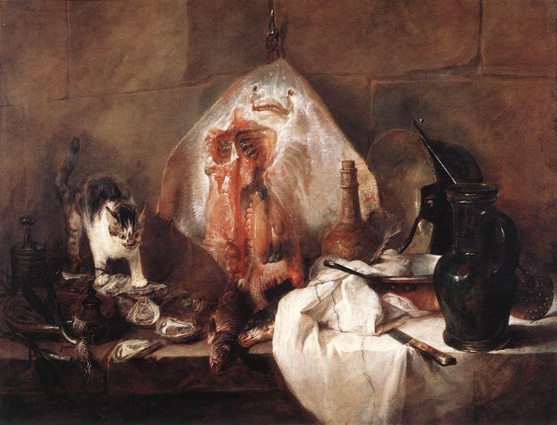
Every culture and time period chimes in with intriguing forms and layers of meaning.
The goddess Athena's beautiful stone face is a perfect representation of the serene, logical Classical Greeks, but just as representative of its culture is this lovely Gabon Mask, in which geometry forms a vital part of the design, and the chalkiness of the face indicates a spiritual connection. Picasso's wild 'Man in a Hat' would seem madness to the Greeks, as well as to Hans Holbein and the court of Henry VIII, to which this pencil drawing of poet Thomas Wyatt gives us insight, but Modern Art finds in it a fresh creative approach to an old subject. Cindy Sherman's use of her own face as a canvas speaks perhaps all too clearly of a contemporary familiarity with complex ideas of questioning identity. Above all, seated around the table of humanity, the commonality of 'Face,' as in these examples, provides a place to begin a powerful conversation about the meaning of being human.
To expand this work and these ideas I'm offering a series of online Art History 'classes' in the form of postcards - Postcard Art History Each of the series follows a theme in in 10 week subscriptions, with art ranging broadly across cultures, styles, time periods, and artists. Each week you receive a pdf postcard with an image on one side and a brief but solidly informative explanation on the other. Week by week you'll see how cultures and eras interweave and share ideas, values, beliefs. You'll discover differences in the art that work to emphasize commonalities in human experience, and you'll be excited to find new insights and discoveries about art and art history. Themes are fun and intriguing, from 'Supermodels: Glamour Girls of Art History,' 'Gods of All Shapes and Sizes.' 'Happy Families', and others - and I'll be adding new themes regularly.   A Postcard Art History series makes a unique, interesting gift for family and friends,  a good way to catch the interest of children, and a great treat for YOU! If you enjoy my ArtSmartTalk blog I hope you'll support Postcard Art History and recommend it to others. Find all details at www.postcardarthistory.com.

Wednesday, December 14, 2011

Cats, Feasts, and Chardin


Cats, like children, are hard to include in serious art - too cute. For a change from the modern art of the last two posts, here's some 'serious' historical art that happens to include cats, by one of my favorites.  I like cats - I have two - and I'm very fond of the artist Jean-Baptiste Simeon Chardin (shown here in a self portrait from 1775.) Born in Paris in 1699, Chardin grew up and spent his life within the city walls without much need or thought for travel beyond. Once he caught the attention of King Louis XV he was granted a studio in the Louvre and lived there until his death in 1779. (At the time the Louvre was an abandoned royal residence being used for artisan workshops and meeting places for the artistic and scientific academies founded by Louis XIV - Chardin went regularly to meetings of the arts academy after he became a member.) Chardin was a true local artist, mostly self-taught but smart and observant - and a quiet revolutionary.  In contrast to the grandiose Rococo art that is the signature of the period, Chardin took his cue from the deceptively simple Dutch still life tradition. The golden age of Dutch Baroque painting was drawing to an end, but  masterful examples of composition, virtuosic effects of light and texture, and the rich possibilities of a simple story told with style and close attention to detail would have been easy for Chardin to find. 'Deceptively simple' is a good phrase to keep in mind for Dutch still lifes as well as for the work of Chardin - there is far more than meets the eye. Many Dutch still lifes feature grandiose settings of lavish expensive foods and exquisite vessels of glass, silver, and brass - they do double duty in celebrating the enormous prosperity of Holland during the 17th century, while also paying homage to the simple pleasures of life, free of tyranny by church or king (many contain intricately coded messages, but that's a complicated subject for another post.) The example by Alexander Adriaenssen (at the top), who died shortly before Chardin was born, is somewhat atypical of Dutch still life, but it is a close match for Chardin. The concentration of raw foods anticipate the feast to come, inviting us behind the scenes to identify with the simpler folk who will do the work of preparation - and shoo away the cat lurking around that tempting pile of fresh fish. Chardin's revolution was this peek behind French aristocratic grandiosity, gently (and probably unconsciously - he was no outright rebel) guiding thoughts to a democratic future that would soon slap France hard across its rouged and powdered face. 'The Ray' from 1728 was one of several early paintings that gained him admission to the Academy. I've always found it to be one of his most interesting stories in paint. There are messages here of life and death, cruelty and comfort. Note the cat (really a kitten) - cute at first glance but with the demonic leer of a killer intent on prey, and in contrast the strange 'face' of the eviscerated ray that evokes a sad commedia del arte clown. The knife - an instrument of death - and the pitcher - a container for water, the stuff of life - hover just at the edge of the table, a precarious position that may be there to remind of us the precariousness of existence. 'The Silver Tureen' also by Chardin, also from 1728, also with a cat, seems a meditation on life, with the cat sitting quietly staring into the blank eyes of his fellow creatures , seeming to question the whimsy of fate. And for dog lovers, 'The Buffet.' There are messages here too, but as far as I can tell the dog is just a dog - always hungry and cheerfully optimistic about that pile of food toppling his way.

Wednesday, December 7, 2011

Modern ArtMan: DeKooning at MOMA

He was a handsome guy, no doubt about it. Even with the 27 cents or whatever it was he had in his pocket when he arrived in New York in 1926, he was going to do something and be somebody - you can see it in the pictures. He paid the requisite art dues for about10 years, working as a sign painter and for the WPA, but by 1935 he was pretty much launched on his career. I doubt, though, if even he knew how important a career that would be. The big retrospective of his work at MOMA - astonishingly, the first major retrospective for him EVER - has been knocking everybody's socks off since it opened on September 18. I certainly concur. It's a fabulous, comprehensive, exhaustive, show, with plenty of 'I never saw that' and 'I didn't know he did that' moments. The first of these comes right at the beginning, with the uncannily accomplished still life he painted when he was a teenage apprentice in his native Rotterdam - it's a 'life's not fair' moment, in a category with the portrait Picasso did at a similar age and young Leonardo da Vinci's angel, so beautifully painted that ever after his master Verrochio (allegedly) devoted himself exclusively to sculpture. The de Kooning of the iconic Woman series is present almost immediately by the fierce sense of energy that pervades his work in all mediums, though he worked his way through several influences and experiments with style. I found the first true 'de Kooning' appearing around 1939 with 'Figure,' a small framed study that looks backward to the elegance and form of Renaissance portraits while also sounding a loud call to the colorful, fractured expression of mid-20th century America art. Arshile Gorky was clearly important for de Kooning; they were exact contemporaries and shared a studio for a while, probably finding comfort in their common status as uprooted Europeans as well as support for their brave adventures in modern art. I saw a lot of Gorky in de Kooning, even in later paintings, no doubt helped along by the recent Gorky exhibition at the Pennsylvania Museum of Art. Both of them had a way with color that was distinctive, aggressively appealing, even jarring, with a kind of exaggerated sweet palette of pinks, greens, and blues. Cezanne's mastery of color came to mind too; de Kooning had as sure a touch with his particular combinations as Cezanne had with his, though de Kooning's are atonal, minor chords compared to Cezanne's deep resonant harmonies. Having said that, I loved his black and white drawings from the 1940's where line and form, splashed and swirled with the same dashing, confident energy, took precedence over color. Gallery after gallery is full of exciting, pulsing shapes and movement; it's like he had a big stew of shapes and ideas constantly on the boil, and he kept stirring it up and pulling out new ways to use the ingredients. The bulbous, throbbing shapes of recognizable limbs and bodies morph into abstract shapes in the drawings, then into more figures, and into his iconic women with their sharp little grinning mouths. One wall is hung with 5 of the Women series, a wonderful intellectual and aesthetic gauntlet. So much has been written about these blowsy, powerful females, much of it stuck on descriptions involving 'angry' or 'frightening.' In my opinion they're rich, somewhat comical, strong, assertive, and assured - they may be aggressive, but why shouldn't they be? De Kooning was looking squarely forward by that time - it's not the old days anymore. At least that's what I like to think, despite knowing that he wasn't always so nice to his flesh and blood wife and fellow painter, Elaine de Kooning. Her portrait in the show is a counterpoint to the Women series on several levels. Calm, subdued, done with virtuoso drawing skill and carefully focused on every detail of her face, it could be an 18th century portrait by Jean-Dominique Ingres. The exhibit continues through the last phases of de Kooning's life and career, encompassing a period of pure abstraction and on, into the years when he suffered from Alzheimer's before his death in 1997. Somewhere in the 70's, although the energy and pure panache with paint and surface never flagged, as evidenced by a gallery full of bravura abstractions, the center started to disappear. In the last years it finally slipped away completely, leaving only the untethered ribbons of those sad late paintings. De Kooning is the acknowledged start to 'Abstract Expressionism,' the movement that dominated art during the middle years of the 20th century and changed everything that came after - the MOMA retrospective is the celebration of one of the greatest contributors to the story of Modern Art.
Exhibition images courtesy of www.moma.org

More about De Kooning: A Retrospective
http://www.moma.org/interactives/exhibitions/2011/dekooning/
http://www.npr.org/2011/12/05/143134807/at-moma-a-look-at-de-koonings-shifts-in-style

Thursday, December 1, 2011

When Modern Art Came to America - Stieglitz and His Artists at the Met

Is John Marin the greatest watercolor painter that nobody remembers anymore? I hadn't thought of him in a long time, but when I saw the exhibit 'Steiglitz and His Circle' at the Met recently, it was a chance to consider him again. It's a very interesting show, focused on Alfred Stieglitz's efforts and successes in bringing Modernism to America in the early 20th century. Stieglitz, best known for his own moody atmospheric photography from street scenes of bygone New York to sensual portraits of his wife Georgia O'Keefe, championed European modernists at his Gallery 291, years before America got its big jarring, choking dose of Modernism with the Armory Show in 1913. The Met sets up the chronology:  first photographs, snow scenes with horse drawn carts and Edward Steichens' beautiful night scene of the Flatiron Building (1904), all recalling a mythic New York that barely resembles hipped-up, maxed-out Manhattan of today. After that (and after annoying his photographer pals for switching his mission) Stieglitz began showing European Modernists, including Matisse, Rodin, Picasso, Lautrec, Kandinsky and others. A room full of intentional shockers - crotch drawings and other 'private' pleasures - gives way to more serious aesthetic engagement with the best and most interesting work at that moment in time. Americans are soon in the mix and the balance is pretty even, in the work if not in the big European names. There was important exchange going on, though it was all one-sided then; New World progressives, including Arthur Dove, Marsden Hartley, Marin, and Diego Rivera grabbed at what the Europeans were doing and built their own brave experiments based on fracturing traditions of space, form and color. After 1913, his monopoly on Modernism broken, Stieglitz shifted almost exclusively to American artists, including Georgia O'Keefe, his newly discovered sensation about whom he supposedly said, "Finally, a woman on paper." Some thought Stieglitz had lost his nerve after 1917 when he closed Gallery 291. A Frances Picabia drawing of a bellows camera is a disguised portrait with a critical message; the bellows is detached so the camera no longer functions. Stieglitz opened The Intimate Gallery in 1925 with a close-knit group of Americans; the last group of rooms in the exhibit are the testament to their will to define and proclaim a Modern art of this soil and this place. There are O'Keefes in abundance, but it was the Marin watercolors that held my interest. He had a particular way of cracking and reassembling space with a nod to Cubism, but with a distinctly individual sense of blend and separation, as if piecing back together a jigsaw puzzle of his own devising. In the exhibit we see the arc of his work, from views of Paris (he spent six years traveling and learning in Europe) into stronger and more confident compositions of American elements - open spaces, broad seas, rocky coasts, as well as brassy New York City. His vocabulary of slashing strokes, dots and dashes, with color that moves from saturated strength to soft diffusion, gives his small-scale work a dimension that can be almost monumental. John Marin was one of Stieglitz's first artists, and their personal and professional alliance lasted 40 years; O'Keefe and Stieglitz were married at his house. There is a lot to see in New York right now. The deKooning show is a definite Do-Not-Miss - but don't miss this one either.

Stieglitz and His Artists: Matisse to O'Keeffe: Metropolitan Museum of Art through Jan 2, 2012
http://www.metmuseum.org/toah/hd/stgl/hd_stgl.htm

Wednesday, November 23, 2011

Happy Thanksgiving - Pass (on) the Irony


Norman Rockwell did not invent Thanksgiving. It may seem like it: if you've ever seen his iconic illustrations for the holiday, you know what Thanksgiving is supposed to be like. There they are (nobody I know but they must be out there) clean, scrubbed, and hungry, ready to dig into the enormous (authentic farm-raised) bird cooked by the loving grandmother, who brings it to the table, her (spotless) apron still in place, to place before the patriarch in his best (well-worn but neatly mended) suit so that he can offer a (modest but sincere) blessing. It's easy, in our ironic, less modest and sincere age, to poke fun at this and other of Rockwell's images, to criticize - where are the people of color?, where are the vegetarian alternatives? - but Rockwell's Thanksgiving images, like much art, must be judged in context to appreciate. It's just as easy to miss the sly bits - the guy in the right corner peeking up at the viewer, breaking the illusion to ask, 'What do you think? Do you believe this?' An illustrator would not want to paint like that now, nor would there be a client for it -  but Rockwell was a master and there is much to admire. Look at the way he places arms and legs, how he uses white or negative space, the subtle play of gesture and angle. Ironically, his most famous 'Thanksgiving' image is, well, a bit ironic. It doesn't represent Thanksgiving - the title is Freedom from Want. This was the cover of the March 6, 1943 Saturday Evening Post, one of Rockwell's celebrated Four Freedom covers, created in the midst of a grueling war to remind America of it's good fortune. (The others are Freedom of Speech, Freedom of Worship, and Freedom from Fear) Some of those freedoms feel under fire these days, with the troubling news of economic and physical battering for too many Americans right now. It is a different time, and art always wears the cloak of its own time and place. Rockwell did do other actual Thanksgiving illustrations, less sober and moralistic. He was a wonderful storyteller in the wholesome American folktale sort of mode, with a rollicking sense of visual humor that matched perfectly to the unironic, self-congratulatory mid 20th century, before hippies, rebels, and civil rights protesters started peeling back the veneer to reveal so much that needed to be admitted to and addressed. Rockwell follows in the footsteps of America's greatest illustrator, N. C. Wyeth, who is best known for his powerful Treasure Island series. He also did what could be classified as Thanksgiving illustrations; in 1940 he began a series of murals about the Pilgrims for the Metropolitan Life building in New York. His take on this American tradition is colorful but somber, with careful attention to historical detail - gravitas fit to a darker time. You can find some of the Pilgrim illustrations gathered into a beautiful picture book, N. C. Wyeth's Pilgrims, by Robert San Souci, himself a prize-winning illustrator. An illustrator has to be a good storyteller - what sets both Wyeth and Rockwell at the top is their handling of story, color, form, detail - everything adding up to so much more than the whole.
Happy Thanksgiving! What does your Thanksgiving look like?

Thursday, November 17, 2011

High Art from the Highlands - Scottish artists at the PMA Craft Show

Scotland was in Philadelphia last weekend, in the person of 25 extraordinary artists at the Philadelphia Museum Craft Show. Each year the PMA Craft Show highlights the finest  work of a particular country - this year it was Scotland, and what a rich showing these northern folk put on. I didn't get to talk to all of them, unfortunately, but I'll point out a few that stopped me in my tracks. I'm always on the lookout for drawing, even if I'm not aware of it, so Claire Heminsley's booth drew me in like a magnet. I felt like I'd found a long-lost sister when I saw her loose line drawings and saw her tribute to her artist dad who taught her about drawing (my father did the same - we used to go out sketching together.) Much of Claire's work involves fabric - printing her drawings on practical items like aprons or tea towels, as well as on multimedia work that combines stitching, typography, printing, and found objects. Her marriage of the ordinary with the ethereal adds up to a wonderful sense of serious fun. See more at  http://www.incahoots.org.uk/index.html   Across the aisle, Stacey Bentley was drawing too, this time in metal jewelry. Stacey is one of those delightful, well-groomed women whose appearance belies the tough reality of the process behind their work - industrial enamels, twisted and soldered metals, multiple firings - her work has a kind of brawny industrial feel in miniature, with an effect that mixes delicacy and grit. Stacey calls it an 'urban aesthetic' and cites influence from what she observes in her travels. See more at http://www.staceybentley.com/index.html.  Fabric is the medium for Jilli Blackwood. Her extravaganzas, some wearable, some decorative, shout excitement across the room, but also pull you in close to examine her marvelous, infinitely adventurous play with cloth, embroidery, stitching, color, and texture. Process and imagination for Jilli, as with most of these artists, are tightly interwoven. She talks of color and hand dying as the entry point for developing her ideas and bringing in the unique personality that marks each piece. She described one piece as based on elephants she observed while creating costumes for the Commonwealth Games in India - it made sense as she pointed out sinuous lines that recall an elephant's flexible trunk and the grey green texture of cloth that stands for an elephant's tough hide - from there, in, on, and around those concrete images, she wove her magic to conjure up a whole visual narrative of association through stitch and color. See more at  http://www.jilliblackwood.com/index.html   Carla Edwards resin jewelry matches Jilli's work for color but is a world apart in texture. Her softly bright pendants, earrings, and brooches, inspired by natural shapes and forms, have a smooth, inviting visual and tactile feel. See more at http://www.carlaedwards.co.uk 
The haunting charm of Karen Akester's small evocative figures is still vivid in my mind - her work was one of the most memorable experiences of the entire show (which, of course, also included much fabulous work by American artists - see my posts from other years about this great Crafts Show.) Karen, educated at Edinburgh's School of the Arts and working there in one of several art communities supported with private and government funds (from what I heard from these artists, the US could learn a lot from Scotland about supporting the arts) was not only delightful to talk with, but an artist whose work rises to that rare place of brilliance in conception and craftsmanship. She creates with glass and metal, sometimes together, sometimes separately, but her figures always add up to more than the sum of their parts. Using vintage photographs of schoolchildren as her starting point, she makes small standing figures, a bit woebegone and melancholy, that quietly spill out an intense sense of dark whimsical mystery. It's impossible not to want to know more - or to start telling yourself their stories, which are surely full of guilty mischief, punishments involving bed without supper - or worse. See more at http://www.karenakester.com/
These artists were all so warm, friendly, interesting and gifted. If only my MacGregor ancestors had been better behaved in the 18th century - if they hadn't been run out of the country as outlaws I might still be there working and hanging out with them. 
For more information about Scotland's Craft Artists in general and these artists in particular go to http://www.craftscotland.org/about-us/our-work/PMA/ 

Friday, November 11, 2011

Chance Falls - Pat Steir at Locks Gallery


I first became aware of Pat Steir when I assigned an Art in America article about her work to a student years ago. I can't remember what the student did with it, but Steir's graceful, mesmerizing work really stuck with me. I was happy, therefore, to find it close to home, in a fine exhibit currently at the Locks Gallery in Center City Philadelphia. The large color drenched canvases seem somehow made for this particular setting with its dark ceiling and columns; the fit of space and content has an organic, inevitable feeling that adds satisfaction to the experience of the show. Any description of Steir's painting includes the word 'waterfall' - the pictures make the description self-explanatory. She treasures the happenstance of art-making, a value she credits in part to her friendship with John Cage, who introduced her to its potential. Steir's work testifies to her chronology - her Action Painting approach connects her not only to the ideas of Cage but also to older, but not distant contemporaries Joan Mitchell and Helen Frankenthaler. Color pours down her canvases in watery, nuanced sheets of layered hue, shade, and value: the action of the making continues in the finished work. At a distance the canvases give off a rich, soothing rhythm, but up close the general blur defines into fine trails that mingle, divide, and pool together. There is also a strong link to Chinese landscape painting, mentioned in the press release for the show, manifested in a feeling of ethereal grandeur as well as the fine layering of organic strokes. Most of the works in the show are named for the pigments she used in creating them: naples yellow, paynes grey, indigo, a particular green or blue. Several include gold pigments. A good part of the pleasure of the work, for me, was inspecting the surfaces at close range, finding the happy accidents that arise from Steir's process - rivulets of gold coursing through, over, and behind sheets of white, blue, green, leaving little nuggets at a crossroad where she made a divide, a buried color suddenly peeping through to make a quietly assertive statement.
Pat Steir: Water and Sand is at the Locks Gallery through November 26.
http://www.locksgallery.com/exhibits_works.php?eid=133